
Introduction
Data is the new gold in today’s high-stressed business, so business intelligence dashboard play a crucial role in helping companies with real-time data analysis. As data is gold for every company, the one that thinks through it will definitely excel in the competition, making better decisions that lead to more successful business. But dealing with the large amount of data being generated every day can be quite overwhelming. And this is where bi dashboard tools play a role, converting raw data into meaningful insights. The Business Intelligence Dashboard, is the center of data visualization, analysis, and decision-making tool.
The Purpose of a BI Dashboard
In simple words, A business intelligence dashboard speeds the ability to analyse data by turning it into visualized charts. It is a graphical representation of the organization’s data that can help consumers understand at one glance the key performance indicators (KPI), trends, or hidden patterns in your dataset.
BI Dashboard Features and Components
A great business intelligence dashboard includes these key features and components, which all connect to give a holistic view of the data of an organization. These features make the dashboard excellent for data analysis and decision-making:
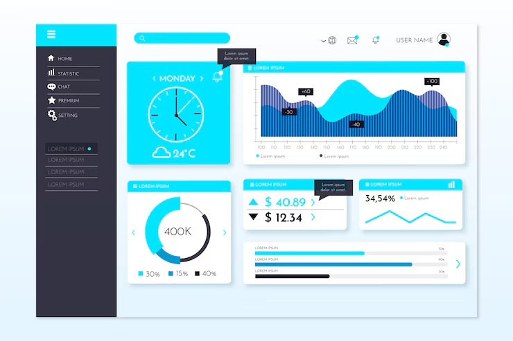
Data Visualization Elements: The focus of any BI dashboard is its data visualization elements. From charts and graphs to maps, the visualization to be used depends on the type of data being displayed and what insight the user is expecting to get through it, e.g., bar charts for categorized comparisons and line charts to represent trends over time. Enrolling in a Power BI course can help users master the creation of impactful visualizations, enabling them to select and design the most effective charts and reports to convey insights clearly and meaningfully.
Interactive Elements: A BI dashboard goes beyond just showing the data. Its interactive touches help users to engage with the data. Filters, drill-downs, and hover-over effects can be defined as features that allow users to run selective data or perform time analyses.
Customization Options: No two businesses are alike when it comes to data, and a dashboard that works one way for another company may not work as well elsewhere. This is why customization is a critical aspect in BI dashboards.
Data Connectivity: A BI dashboard is required to establish a connection with multiple sources of data, like databases, cloud services and third-party APIs. These connections guarantee the dashboard receives the most correct and fresh data available.
BI Dashboards vs. BI Reports
The two purposes are related to how we present users with data; they can be viewed and used in rather different ways as tools:
| BI Dashboards | BI Reports |
| These tools are designed to be easy and user-friendly for ongoing monitoring and decision-making. Dashboards are well-suited for executives and managers who need to monitor the company. | On the other hand, BI reports, which are usually static files, help in detailing the analysis of particular data sets. Sometimes, this type of report is run very regularly: daily runs or weekly, monthly runs and used for deeper analysis rather than in the heat of battle when a quick decision needs to be made. |
| These give you the birds-eye view, while letting you deep-dive where and when necessary.
|
BI reports are beneficial to analysts and teams who want to look back on the history or do an audit at a granular level.
|
Benefits of BI Dashboards
Hence, there are lots of advantages to implementing a BI dashboard in an organisation. This goes beyond the sheer data that is being shown and rather allows to make business operations as a whole more efficiently and effective:
- Improved Efficiency and Productivity: BI dashboards make it faster and easier to gather data which saves time in collecting information. Now, employees don’t have to spend hours pulling data from multiple sources and creating manual reports.
- Enhanced Decision-Making: When decision-makers are able to mine data on the go and with interactive visualizations, they can easily detect patterns and anticipate challenges before they occur, thus making decisions based on real-time evidence. This will facilitate faster, more intelligent decision-making, which is vital in a competitive business landscape.
- Improved Collaboration: BI dashboards available for many users throughout departments can create better collaboration within the company. It allows teams to offer their insights and discuss planned data strategies in better harmony across the board. This means more unified strategic alignment across the business.
How Can We Create a BI Dashboard?
There are many steps involved in designing a BI dashboard. Here’s a step-by-step guide:
- Setting Goals: The first step before you even build your dashboard is to have a clear idea of what the point of this thing will be. What Specific Business Problem? Which data points should you monitor? Define objectives — this will allow you to keep the dashboard in line with what actually matters for your business.
- Data Source Integration: Moving from data analytics to an operational dashboard, the next step is selecting the required data sources for your dashboards. Internal sources like your CRM or ERP system and external ones such as social media data streams or market data. Make sure that these sources are easy to integrate with your dashboard tool.
- Selecting the BI Tool: One of the most important steps for your dashboard is choosing the right Access to toolBI. Key Deliverables Ease of use, customization options Data connectivity Cost There are a lot of popular BI tools like Tableau, PowerBi and QlikView, each with different available features & possibilities.
- Creating a Dashboard Layout: The layout of the dashboard should be simple and easy to use. Website with key KPIs in the top row. Keep the design clean and reduce any clutter so that the data is easy to interpret. Think about how the information will flow and how users will interact with this dashboard.
- Test and iterate: Once built, you should test your dashboard with real users. Collect input on the usability, accuracy and appropriateness of data. Put this feedback to use, refining the dashboard and doing whatever it must take (within reason) to enhance its performance.
- Educating users: To get the most out of your BI dashboard, make sure that you have given proper training to all who are going to use it. This involves knowing the data that is shown, how to navigate through a dashboard and what insights it shares.
Best Practices of BI Dashboard Design
A good-looking BI dashboard isn’t just functional but user-friendly as well. Best practices to follow.
- Keep It Simple: Try not to cram all the information on the dashboard. Concentrate on your business’s crucial metrics. Too much on your dashboard is distracting and defeats the purpose.
- User Experience: Design a dashboard from a user experience point of view. Intuitive design: users should be able to find what they are looking for easily. This always meant making it easier for the user to find information without having to click multiple screens.
- Appropriate Visualizations: Select visualization based on the data that needs to be represented. For example, line charts can be used to show trends and pie charts for proportions. The aim is for the data user to understand it as quickly and efficiently as possible.
Evaluating the Modern BI Solutions
The BI landscape has been rapidly changing over the years, with newer tools and technologies popping up every now and then. Critical Considerations for Modern BI Solutions.
- Scalable: Does the tool scale with your business? Just like having your shoes tailored to a perfect fit, as you grow out of the solutions above and have more complicated relational queries or are dealing with bigger data sets, everything changes in order to run.
- Integration Capabilities: By Implication, the BI tool should be able to integrate with your current systems and data sources. Aggregating data across multiple sources depicts a complete picture on the dashboard; you need to be able to pull in all your toxicity incident and response metrics.
- Cost: Even if you are lured by the initial cost of installing the BI tool, make sure to inquire about the hidden & post-installation costs.
- User-Friendly: The solution should be easy and usable by all members of the organization, not strictly IT folks or data analysts. A click-friendly environment: This means more people are using your dashboard.
BI Dashboard Examples and Use Cases
BI dashboards can be customized to different industries and departments. This post contains illustrative examples and scenarios.
- Sales Dashboard: A sales dashboard can measure things like monthly revenue, sales targets, and conversion rates. This enables sales managers to keep track of team performance, rank best-selling products and predict future revenue.
- Marketing Dashboard: This might show data about campaign performance, website traffic, and customer engagement. For marketing teams, KT is a way to make campaigns more efficient and ROI-transparent & customer behaviour- evident.
- UI Elements: Financial Dashboard: Monitor cash flow, expenses and profitability through dashboards for finance teams. Such a dashboard is essential to help one monitor their financial health and hence make well-informed decisions on the finances that they ought to maintain at lows.
- Human Resources Dashboard: Employee performance, turnover rates and recruitment metrics could also be monitored through HR dashboards. Such details can aid HR professionals in increasing employee engagement and enhancing the hiring process.
BI Dashboard Vendors and Their Products
There are many BI dashboard tools available from various vendors, and each has its own set of benefits as well as limitations. Below is a quick summary of the main ones:
- Tableau: Tableau, one of the leaders in data visualization capabilities, finds itself a part-time role and is used widely by businesses of all capacities. It comes with a wide variety of customization options and can be used to connect data from tons of other sources.
- Microsoft Power BI: As a user-friendly tool, Microsoft PowerBi is designed to work well with other offerings in the Microsoft portfolio. It is a great solution for those who are already utilizing Microsoft Office and need an easy-to-deploy tool.
- QlikView: QlikView provides an unusual associative data model for users to analyze the data more intuitively. It is designed to be used by enterprises which require extensive and complex data analysis.
- Domo: Domo is an enterprise cloud-based BI platform that uses real-time data that is updated directly into the cloud and provides some great collaboration features. For enterprises that have scalability in mind as they expand, it can be a great option.
History and Evolution of BI Dashboards
Previously, businesses depended almost entirely on static reports or dashboards, which got delivered usually after weeks created by IT departments. All of this changed with the advent of BI tools during the 90s, which enabled organizations to interact with live data. It has evolved into more advanced features- predictive analytics, mobile versions of BI applications, and capabilities like machine learning.
BI dashboards are no exception and have evolved along with the growing trend for data-driven decision-making in business. In future evasion of technological obstacles, BI dashboards will move past the warehouse to enhance and become more flexible while gaining deeper insight.
Conclusion
To end, businesses should invest in a Business Intelligence Dashboard if they want to use their data to make smarter decisions. The core benefits are real-time perspective, a unified interface to access data from disparate source and productivity enhancement. Organizations can build dashboards that make them win by adhering to design best practices and selecting the right BI tool.
Frequently Asked Questions
- What are the three types of dashboards?
A: The three types are operational dashboards (for real-time data for day-to-day operations), analytical dashboards(data analysis and insights), and strategic dashboards(high-level performance metrics tied to business goals).
- How can a business intelligence dashboard help a business with data collection?
A: BI dashboard consolidates data from different sources so that you can manage analyze everything in a single location. This provides a single view of the consolidated data, which helps identify trends and insights and make decisions quickly. This is termed big data.
- What is the purpose of a business intelligence dashboard?
A: Stream of Data Visualization & Insights: A BI dashboard is ideally meant to allow analytics in real-time so that informed decision-making can be supported by it. For your business to be successful, you need an eye on performance metrics, goal progress and the ability to adapt at a moment’s notice.
- What are the benefits of the dashboard in Business Intelligence?
A:Benefits: Increase Efficiency Better Decision Making Better Data Access Organization-Wide Collaboration